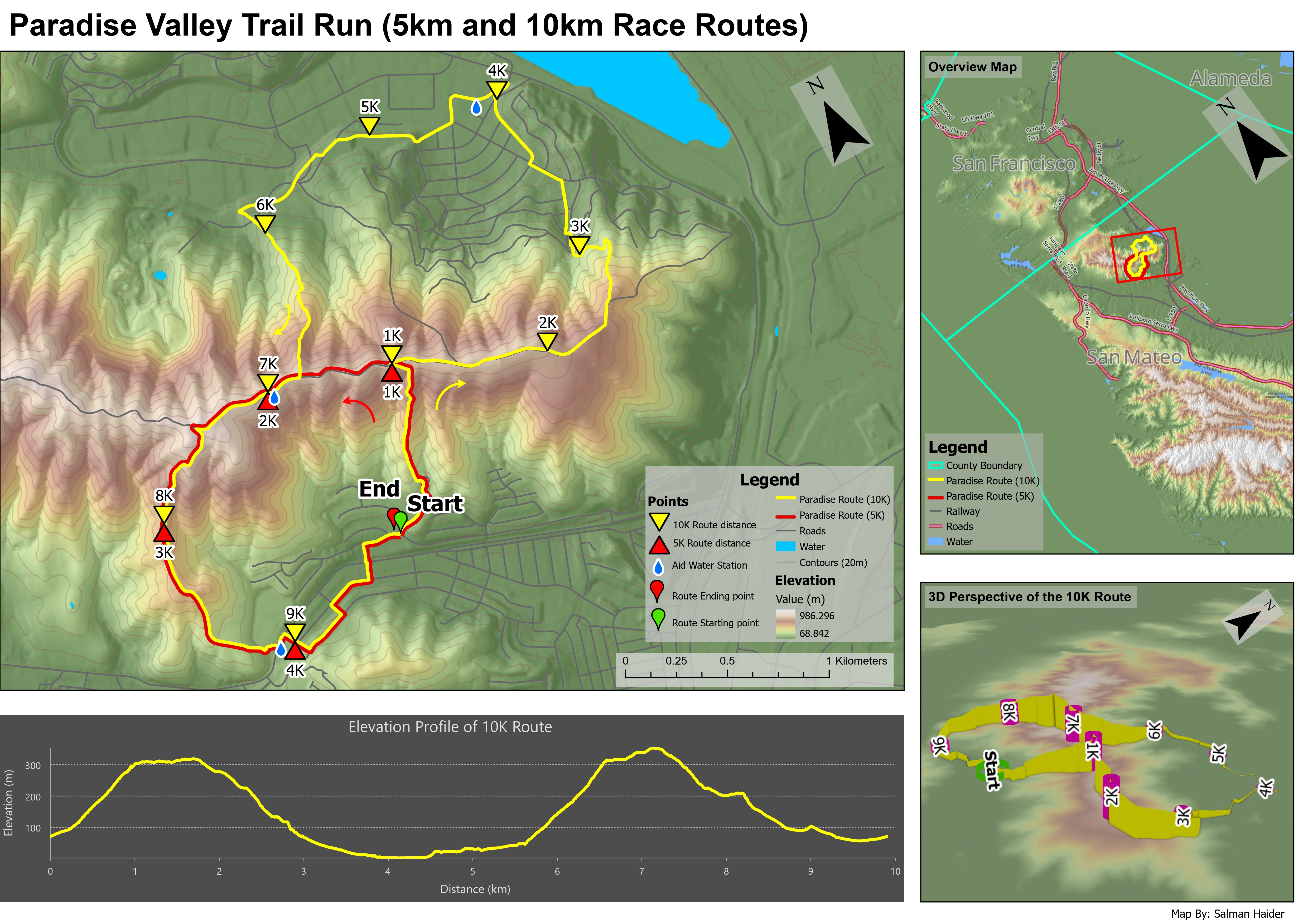
What this map was made for
This map was built as a practical trail race layout. I wanted it to work for runners, supporters, and anyone trying to understand the route before the race. Because the area is hilly, the map needed to show more than just the route line. It also needed to explain the shape of the terrain and how the route moves through higher and lower areas.
How I built the terrain base
I started with a digital elevation model and used it to build the terrain backdrop. I created hillshade, contour, and curvature layers and then adjusted the transparency and layer order so the terrain looked detailed but not too heavy. The curvature layer helped sharpen the terrain surface by showing where the land bends, such as ridges, valleys, and smoother slopes.
I tested different contour intervals before choosing 20 metres. Smaller intervals made the contour lines too close together and cluttered the map. Larger intervals removed too much useful terrain detail. The 20 metre interval gave the best balance between readability and terrain detail.
How I showed the 5K and 10K routes
The route information needed to stand out clearly over the terrain. I used a bright yellow line for the 10K route and a red line for the 5K route, because both routes overlap in some places and needed to remain easy to separate. I also added distance markers, start and end symbols, water station symbols, and route direction arrows.
I kept the route symbols bold because they are the most important information for a race map. Roads, water, contours, and other background layers were kept more subtle so they provided context without competing with the trail routes.
How the layout supports the map
The layout includes a primary terrain map, an overview map, an elevation profile, and a 3D perspective of the 10K route. The overview map gives regional context for people unfamiliar with the area. The main map focuses on route detail, while the elevation profile and 3D view help explain how difficult the route may feel.
Most layout components were useful, but I felt the 3D perspective and elevation profile repeated some of the same information. The elevation profile communicates the route difficulty more precisely, while the 3D view gives a more intuitive sense of the landscape. In a future version, I might give more space to one of these instead of using both at the same size.
What the map shows
The map shows that the 10K route has a more complex terrain experience than the 5K route. The elevation profile shows two major climbing sections, with a lower section around the middle of the course before the route climbs again. This would help runners understand where the route may feel more difficult.
The 3D view adds a more realistic impression of how the route sits on the land surface. It helps show where the trail rises along ridges and drops into lower terrain. For someone who has never visited the area, the 3D view makes it easier to imagine what the trail may feel like in real space.
What I learned from this map
This map helped me understand how important balance is in terrain cartography. Terrain layers can quickly become too strong, especially when contours, hillshade, curvature, routes, symbols, labels, legends, and charts are all placed in one layout. I learned that each layer needs a clear purpose.
The biggest design decision was deciding how much terrain detail to show. I wanted the terrain to be visible enough to support the race story, but not so strong that it distracted from the route. The final map became a good example of combining spatial analysis, cartographic design, and 3D visualization in one product.