What this map was made for
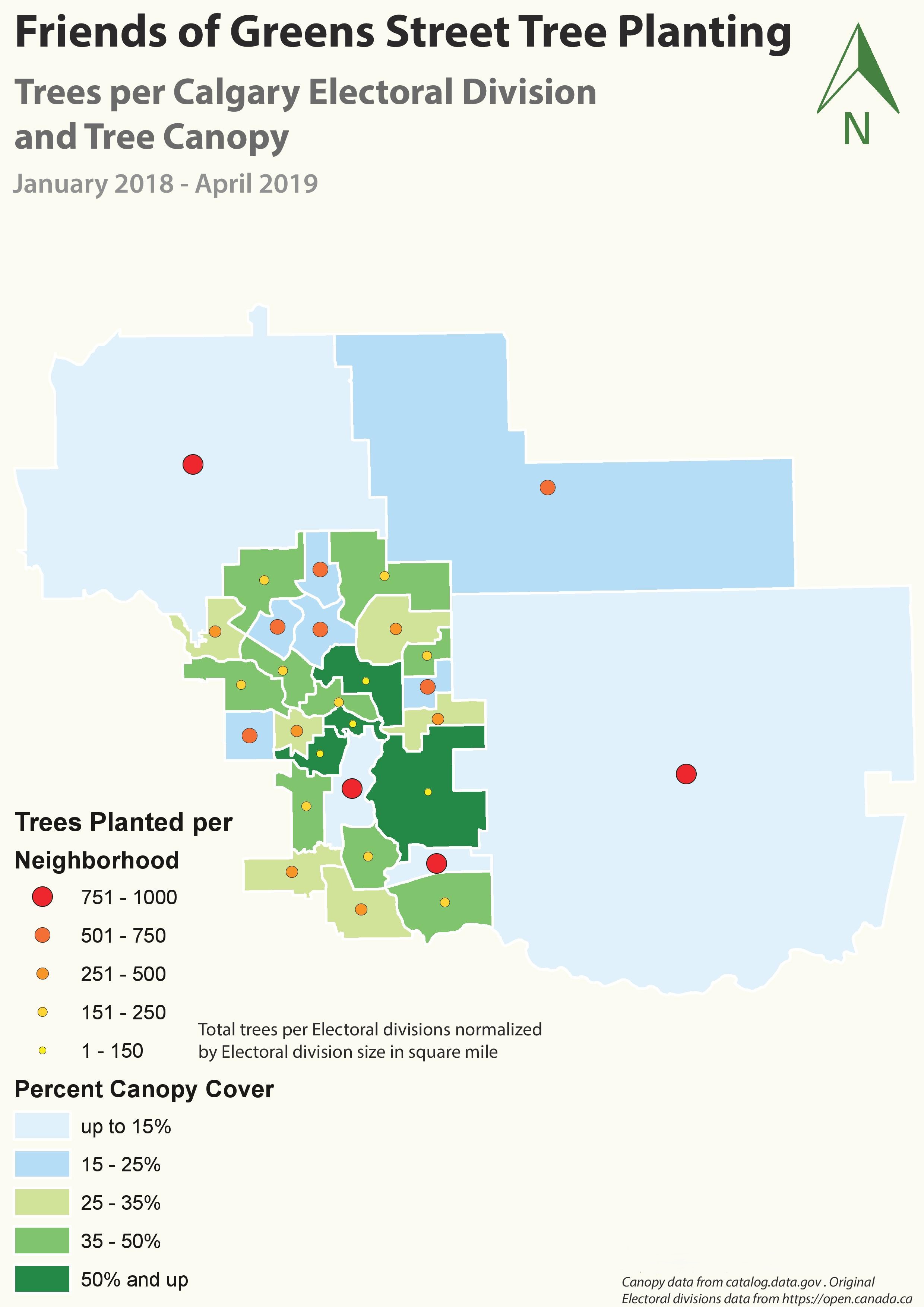
The purpose of this map was to compare street tree planting activity with existing tree canopy cover across Calgary electoral divisions. I wanted the map to show not only where trees were planted, but also whether planting activity was happening in places with lower canopy cover or in areas that already had stronger tree coverage.
This makes the map useful for thinking about urban greening priorities. Tree planting is connected to shade, heat reduction, air quality, stormwater benefits, and neighbourhood livability, so the spatial pattern of planting matters.
How I built the map
I worked with electoral division boundary data and tree canopy percentage data. I joined the canopy cover values to the electoral division polygons and classified the polygons into canopy percentage ranges. These ranges were shown with a blue-to-green color ramp, where lighter blue areas represent lower canopy coverage and darker green areas represent higher canopy coverage.
I then added the tree planting records as point data and symbolized them with graduated circles. Larger red and orange circles represent places where more trees were planted, while smaller yellow circles represent fewer planted trees. The planting totals were normalized by electoral division size in square miles so larger divisions would not dominate the interpretation only because they cover more area.
How I showed two variables together
This map uses a bivariate-style design because it shows two related environmental variables at the same time. The polygon color shows percent canopy cover, while the graduated point symbols show tree planting activity. This allows the viewer to compare where trees were planted against the existing level of canopy cover.
I kept the overall layout simple so the data remained the focus. The light background gives the map a clean appearance. The blue-to-green canopy ramp supports the environmental theme, and the yellow-to-red planting points stand out clearly against both the blue and green fills.
Why I chose these symbols and colors
I used blue for low canopy areas and green for higher canopy areas because this makes the map easy to interpret visually. Blue suggests limited vegetation or lower canopy presence, while green naturally communicates stronger vegetation coverage. For planting activity, I used graduated yellow, orange, and red circles so higher planting totals would immediately stand out.
The legend was placed on the left side to make both variables easy to read. The map title and subtitle clearly identify the subject, geography, and time period. I also used a green north arrow to match the environmental theme and keep the layout visually consistent.
What the map shows
The map shows that canopy cover is not evenly distributed across Calgary electoral divisions. Some central and inner divisions have stronger canopy cover, while several outer or larger divisions show lower canopy coverage. Tree planting activity also varies by neighbourhood, with some areas showing larger planting totals than others.
By comparing the point symbols with the canopy background, the map helps identify whether planting efforts are reaching lower-canopy areas. This type of comparison can support future planting decisions by highlighting areas where canopy improvement may still be needed.
What I learned from this map
This project helped me understand how useful GIS can be for urban environmental planning. A map like this can communicate more than one dataset at once, but the design has to be handled carefully. If the canopy colors or planting symbols are too similar, the relationship between the two variables becomes difficult to read.
I also learned the value of normalization. Without normalizing tree planting by electoral division size, larger divisions could appear more important simply because they cover more area. The final map improved my skills in data joining, classification, graduated symbology, environmental mapping, and visual communication for urban greening decisions.